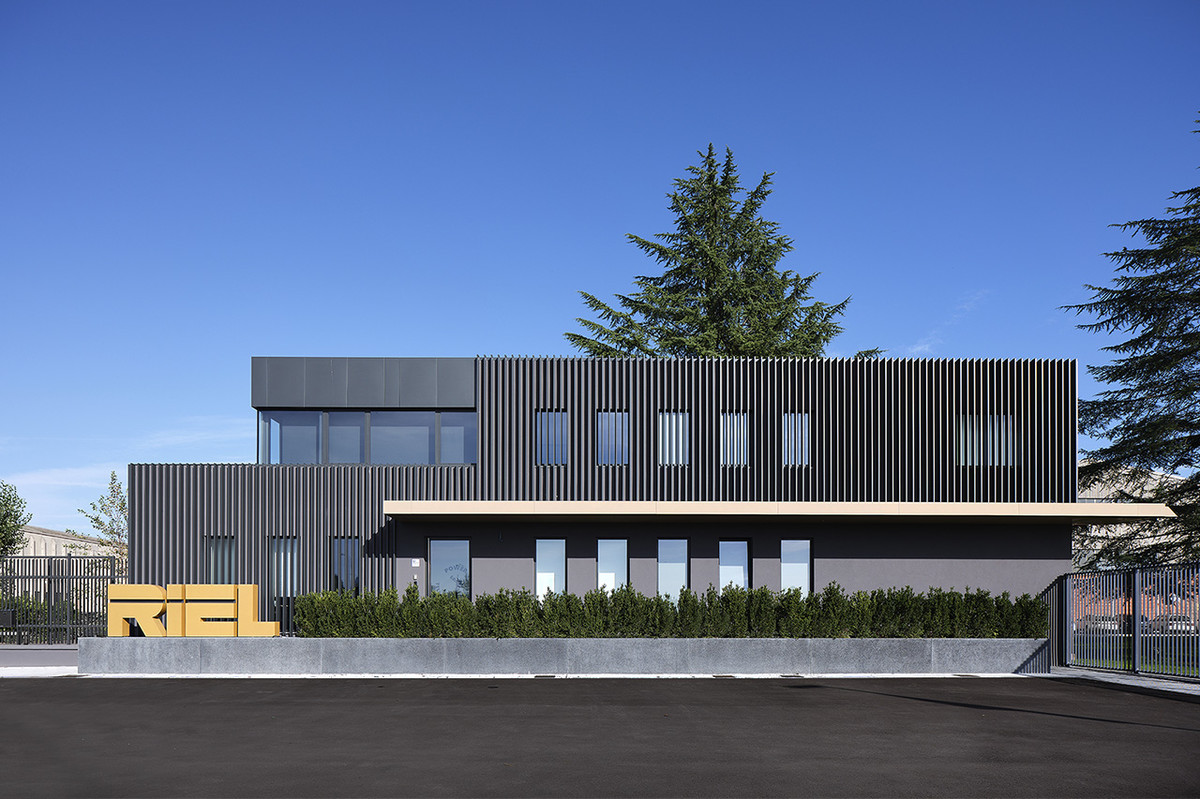
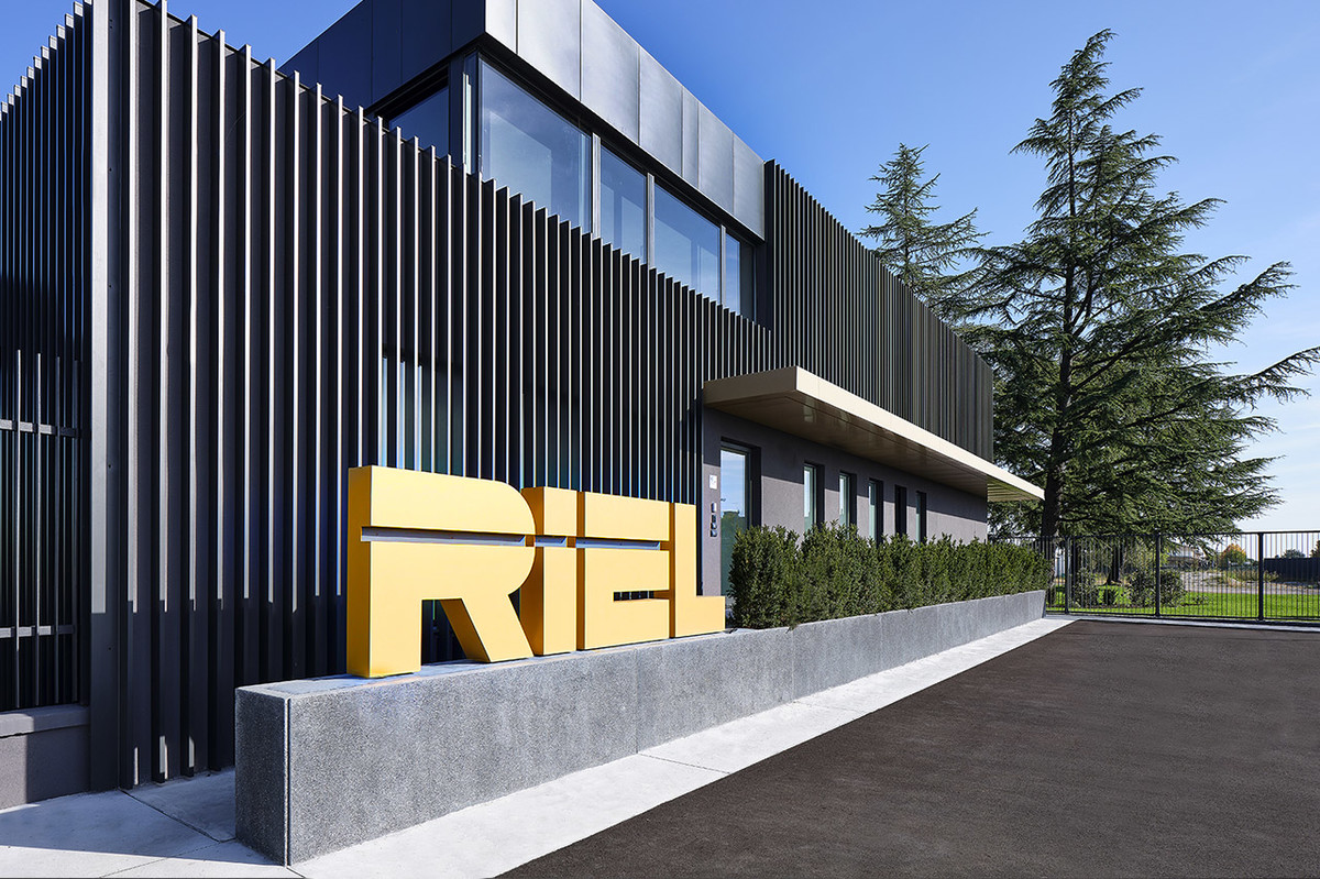
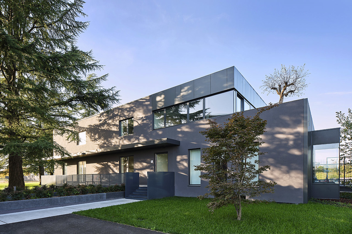
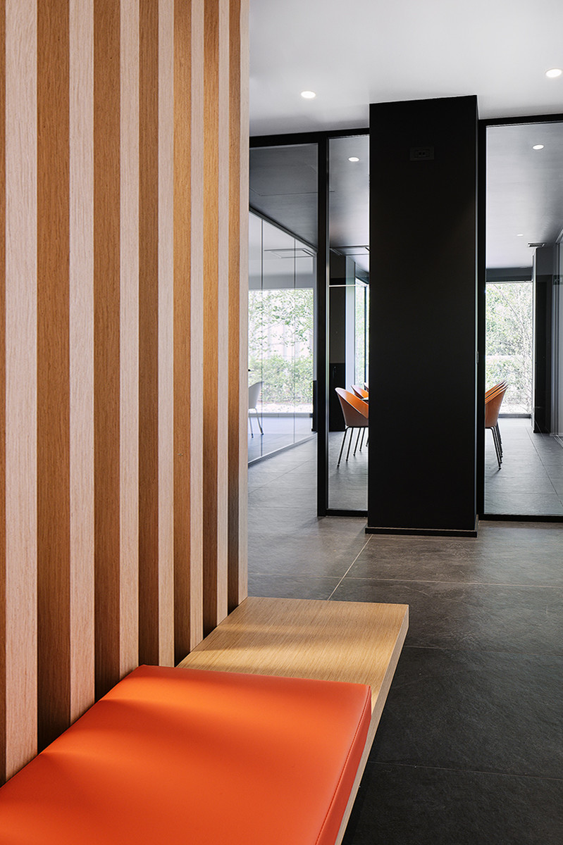
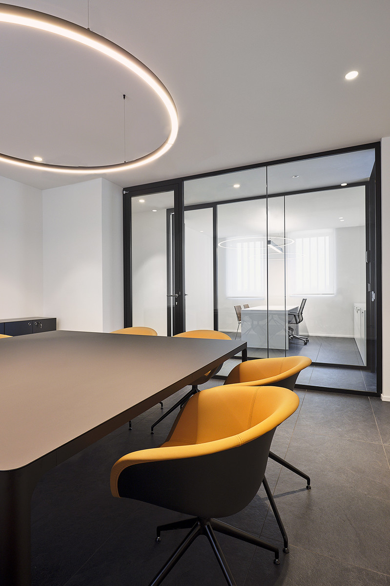
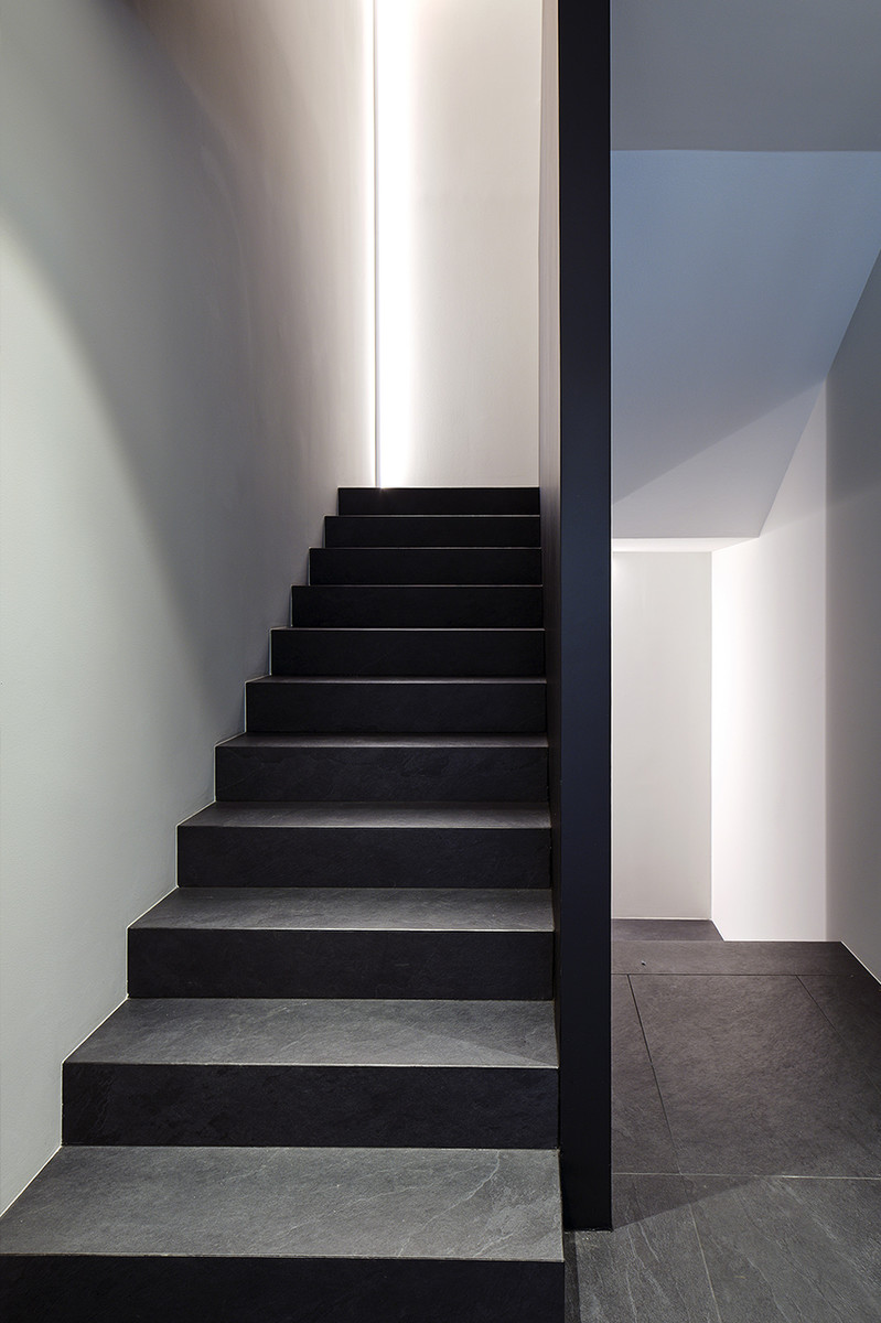
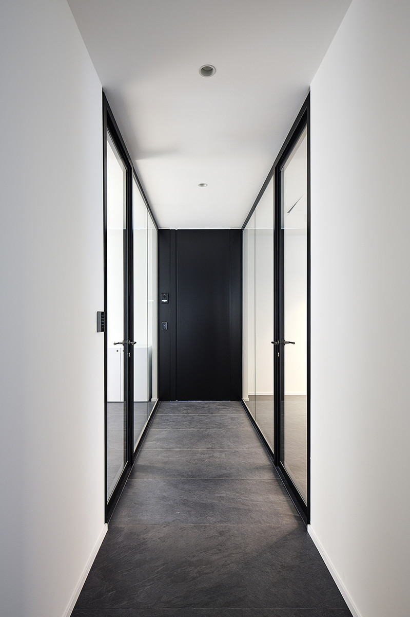
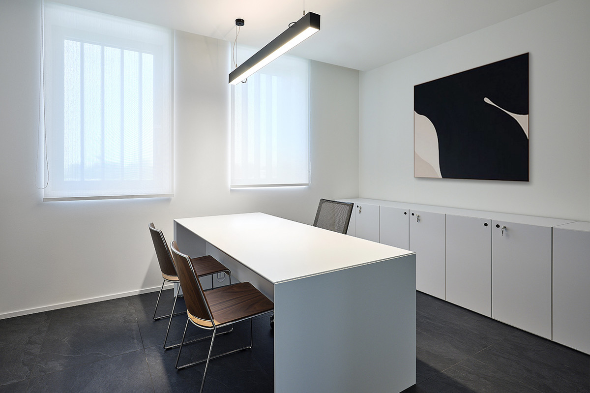
Designing a company’s new head office is not just a matter of designing, but also a way to affirm the identity of the building. Volumes, plays of light and shadow want to be a means of conveying the personality of the society, in the phisical space and also in the market in which it operates. The main character of the project and the interpretation language is contrast: the gold of the canopy and the logo contrasted by the volumes is a way of catching the eye of the street; on the inside, black and white colours are softened by the presence of wood and fabric elements, defining a technical and welcoming work environment.



are you interested in some elements of this photo? ask for information.